Two surfaces, space and torn paper, and two inks, cream and red. Red is the planet: headlines, numbers, the one active thing. Cream is for display type on black.
Anton, always upper case, carries every headline; Montserrat does the rest. Sizes are the frame's (1512 px wide); the site scales the frame on wide screens and uses fluid sizes on phones.
Radii: pills for anything you press, 20 px for fields and panels, near-square slabs for the work.
Depth on paper is soft and low, straight from the mockup's drop shadows:
45 icons on a 24 px grid: 1.8 px round strokes in currentColor, and filled glyphs for the theme's own shapes. Use the sprite: <svg><use href="icons.svg#arrow-right"/></svg>, or a single file from icons/.
Vector where it can be, rendered at 2x where the mockup's gradients need it. Torn edges keep their black side clear, so the live starfield shows through.

tear-down.svgBlack sheet above, paper below (landing, content)

tear-up.svgPaper above, black sheet below (connect band)

tear-down-3.svgThe connect band's lower edge
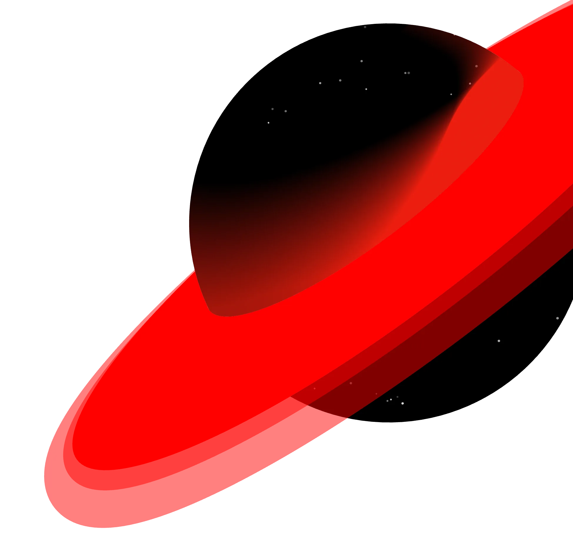
s1-planet.webpThe landing's black world in its red ring (2x)
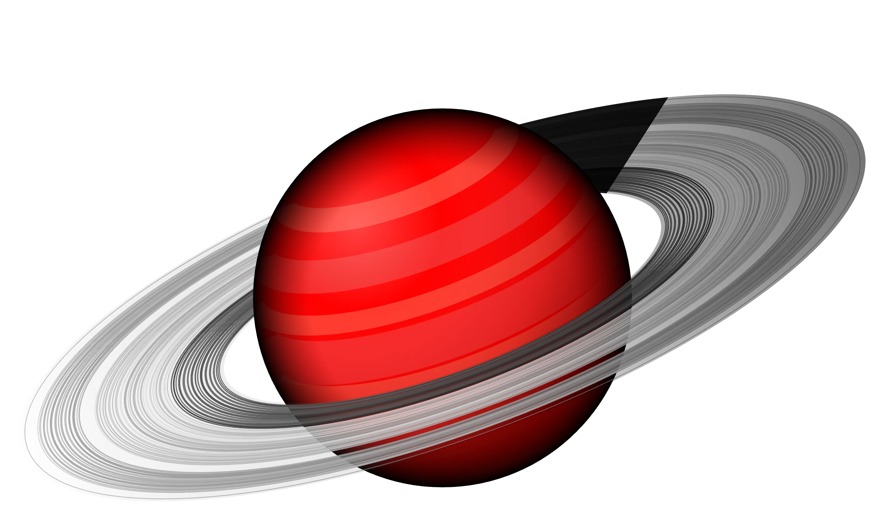
s2-saturn.webpThe red Saturn over CONTENT (2x)
red-planet.svgThe world, flat: splash, badges, favicon

glow-ring.svg + mantra-star.svgThe footer emblem's two layers
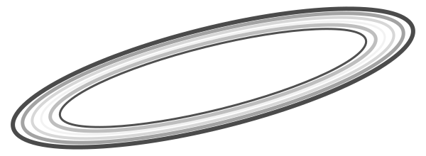
orbit-ring.svgSaturn's ring bands in greys
starfield.svgA 400 px tile of the mockups' stars
Unhurried and weightless: worlds float and sway, the emblem turns, type rises out of a mask. Every loop is a class with custom properties; reduced motion stops them all.
.rp-float--amp 12px · --dur 8s · sine
.rp-sway--deg 2.5° · --dur 11s · alternate
.rp-spin / .rp-spin-revstar 160s, rings 120s / 90s
.rp-glow + .rp-breathe3.2s glow, 6s breath
.rp-cometa streak every few seconds
.rp-twinkle2.8s, staggered by --delay
.rp-mask riseletters 60 ms apart, 1.4s expo-out
[data-rp="tear"]paper tears in from the left, 1.4s
| Move | Where | Spec |
|---|---|---|
| Splash | first load | red ring fills with load progress; star spins 14s; iris closes 1.3s expo.inOut |
| Hero rise | PO 20 / RT 26 / FOLIO | each line yPercent 105 → 0, blur 12 → 0, 1.6s expo.out, 0.1s stagger |
| Planet in | landing world | opacity 0 → 1, scale .94 → 1, rotate -6° → 0, 2.6s power3.out; then float 10px / 9s and sway ±2° / 12s |
| Headline mask | DEEPAK SHARMA, CONTENT, LET’S CONNECT | chars yPercent 110 → 0, blur 10 → 0, 1.25s expo.out, 30–60 ms stagger; reverse on leave |
| Pop | stats, chips, form | y 30 → 0, blur 6 → 0, 1.1s expo.out, 0.05s stagger |
| Count up | 7+ · 6 · 4 | 0 → n, 1.8s expo.out |
| Saturn | content hero | float 12px / 8s; scroll parallax 0.18 |
| Corridor | the work | slabs turn on Y: 62° near the middle, 26° at the ends; drag or arrows glide 5.5/s; centre card shows the real work |
| Marquee | name band | 0.7 px/frame, speeds up with scroll velocity (×5 max) |
| Emblem | footer | star 160s, outer mantra 120s, inner 90s reversed; glow breathes 6s |
| Hover | buttons, chips, labels | go-dot turns red, rotates -12°; chips lift 3px and fill red; magnet pull 0.18 × offset |
Each component sits on black by default and switches when it is inside [data-surface="paper"]. The site's own class names share the same rules.
Nav pills, the moving red mark, and buttons on space.
On paper: slate nav labels, white pill, bare SEE MORE.
Chips (skills): white glass and a soft drop; they fill red on hover.
Topic pills and fields: the contact form's parts.
- dpsharmab1@gmail.com
- Based in
- Hyderabad, India
- Works
- On-site in Hyderabad
Remote worldwide
Info panel (contact card).
- 7+
- Years in design
- 6
- Roles since 2018
- 4
- Core disciplines
Stats and experience rows on space.
Marquee band with spinning sparkles.
The work as slabs in a corridor: the nearer the middle, the more edge-on, the red spine catching the light. Move the pointer across to walk it. On the site the middle slab turns its face to show the real project.
The page is the three frames stacked (1512 × 7856). Wide screens scale the frames as a piece; below 1024 px, or on a tall screen, the sections reflow in one column with the same order and surfaces.
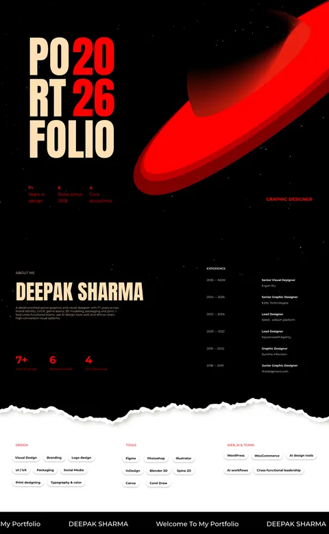 Landing · spaceAbout · spaceSkills · paperMarquee
- Landing · PORT/FOLIO 2026 left (x 130), world top right, three stats at y 848, role at x 1223
- About · name and bio at x 72; experience in a 440 px column at x 950
- Skills · torn paper, three chip columns at x 72 · 578 · 1044
- Marquee · black band, 109 px
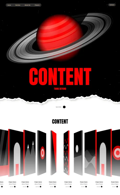 NavSaturn + CONTENT · spaceSee more · paperThe work · paper
- Hero · Saturn centred, CONTENT 250 px red at y 839, THINK BEYOND under it
- Tear · y 1156–1356, then paper to the end
- The work · CONTENT 64 px black at y 1497, the corridor y 1620–2230, labels at y 2286
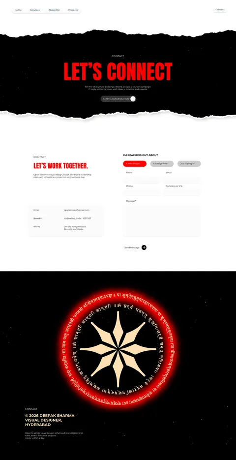 Connect band · spaceContact · paperFooter · space
- Connect · torn black band y 145–810, LET’S CONNECT 130 px red
- Contact · copy and info panel left (x 215), form right (x 788)
- Footer · the emblem centred (y 1858), credits at x 161